
TrueCar
The Original Equipment Manufacturer Portal
The OEM Portal is a TrueCar-to-car manufacturer (business to business) web tool for managing marketing materials with a user-friendly analytics platform. Myself and two other interns (Inseong Jo and Erin Singer) took the product from inception to a working prototype over 10 weeks, winning the award for "Best Executed Project".
The Problem: The current analytics tools out there for the automotive industry are archaic and difficult to use. Moreover, TrueCar needs a way to expand their partnerships with manufacturers by allowing representatives to directly alter marketing materials, as well as showcase the high volume of real-time data that TrueCar has to offer manufacturers.
Step 1: Research
First, as new hires, we dove into reading documentation and attending workshops to better understand the products that TrueCar puts out and get a feel for all of the resources at our disposal. Then, we conducted interviews with personnel in the company who were in roles similar to those of our target users to determine feasibility, as well as determine the strength of the market for automobile data analytics tools. These personnel ranged from the President, a former executive at Hyundai, to Product Managers who interfaced with the OEMs on a regular basis, to the legal team, to verify the amount of information we could reveal in product (cross-OEM data).
Some of the questions that we asked included:
- What would someone in your position at a car manufacturer want in an analytics tool?
- What are some problems with the current way that the car industry utilizes data?
- Do you have a wishlist for tools in brand marketing or data? What's on it?
- What are some features that you think would optimize your work flow?
We learned a variety of interesting things (and some boring automotive information I won't bore you with):
- The best platform for us to use is a web-based tool. The automotive industry is mildly behind the times and we need to cater to an older generation of users who may not find it convenient to use smartphones and tablets, but also keep it transferrable and transportable. A website makes it easy to pull up marketing tools and data on a whim, on any device.
- Existing experiences are not optimized for non-power users.
- Data is the most important tool, and if possible, we want to display real-time data with the ability to compare across time, make, model, and chassis style. Data usually comes in with huge delays, up to a month behind actual sales, so most business decisions are based on educated guesses.
From these interviews, we settled on designing for three main personas:
- The Executive: light use, high level data
- The Analytics Guy: power user, highly specific data, high customizability
- The Marketing Coordinator: medium use, specific data, high customizability
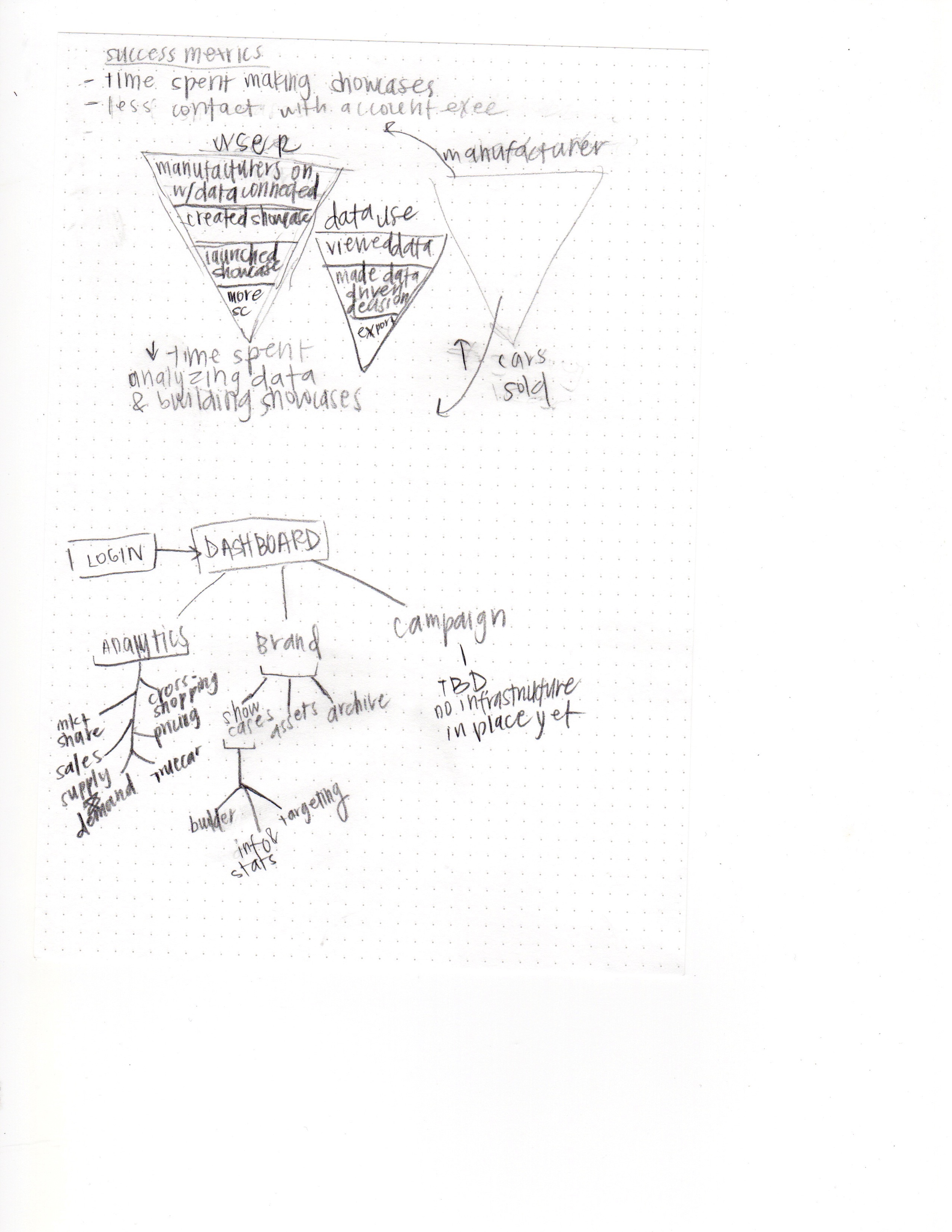
Step 2: Information Architecture
We used this time work on the navigation design in conjunction with the information architecture. Working with our mentor, we abstracted out all of the different steps and features that a user might need, based on the information gathered in our research. During this time, we also scoped our project to figure out how much of the product we could complete in the span of our ten-week internship. As you can see below, we separated out three main components, Analytics, Brand, and Campaign, ultimately deciding that Campaign was, at the moment, not feasible.
Since where were only two levels of navigation, we decided that an accordion-style navigation would be most suitable.
Step 3: Wireframing and Iteration
The images below show a snippet of the iteration process that we went through, from general pagination, to a goofy layout of important call-to-actions, and a relatively detailed wireframe of the landing screen for an individual "showcase" for a vehicle or brand on the TrueCar application.


A selection of screens from the pages in varying degrees of finality (click to view lightboxes):


Step 4: Final Touches and Prototyping
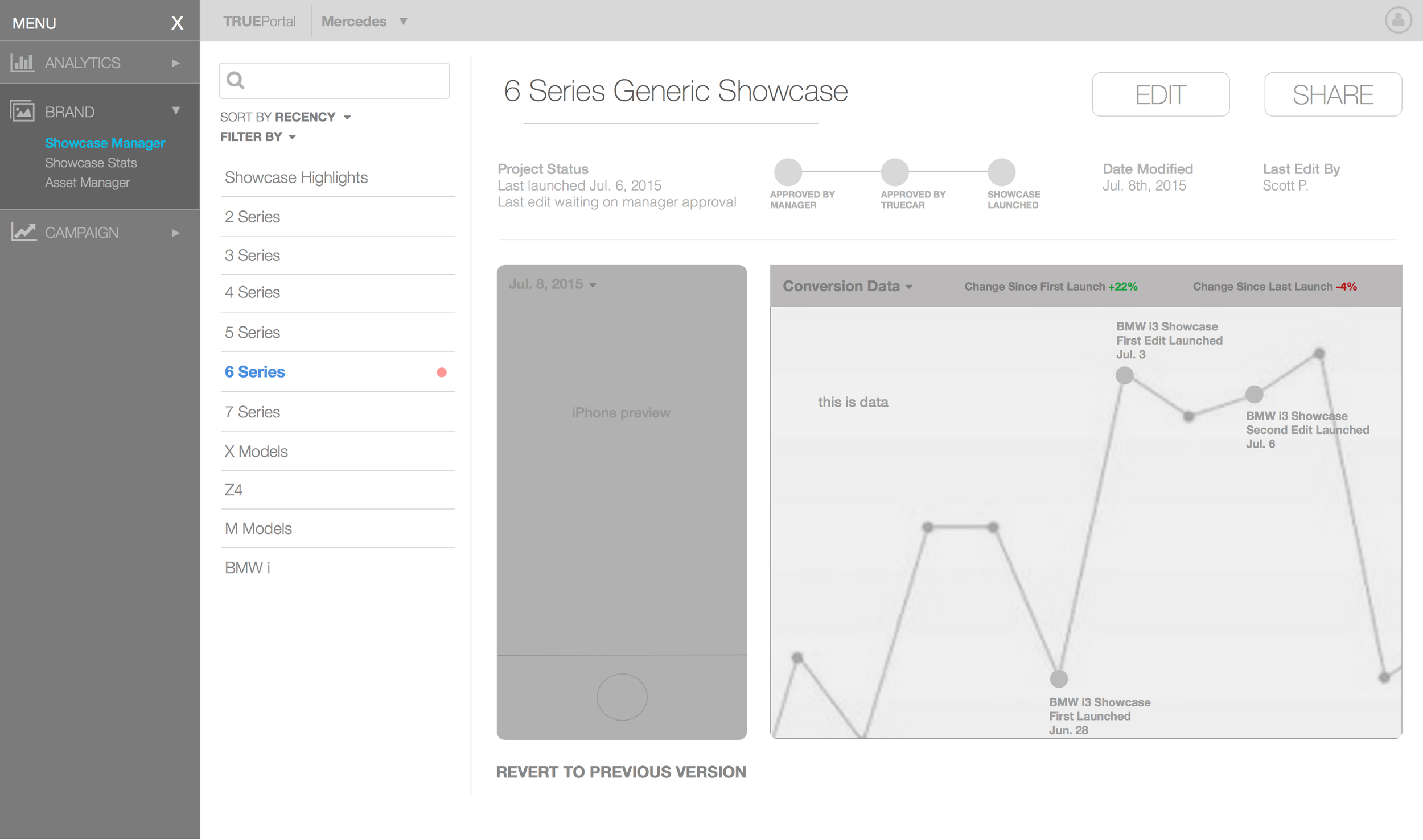
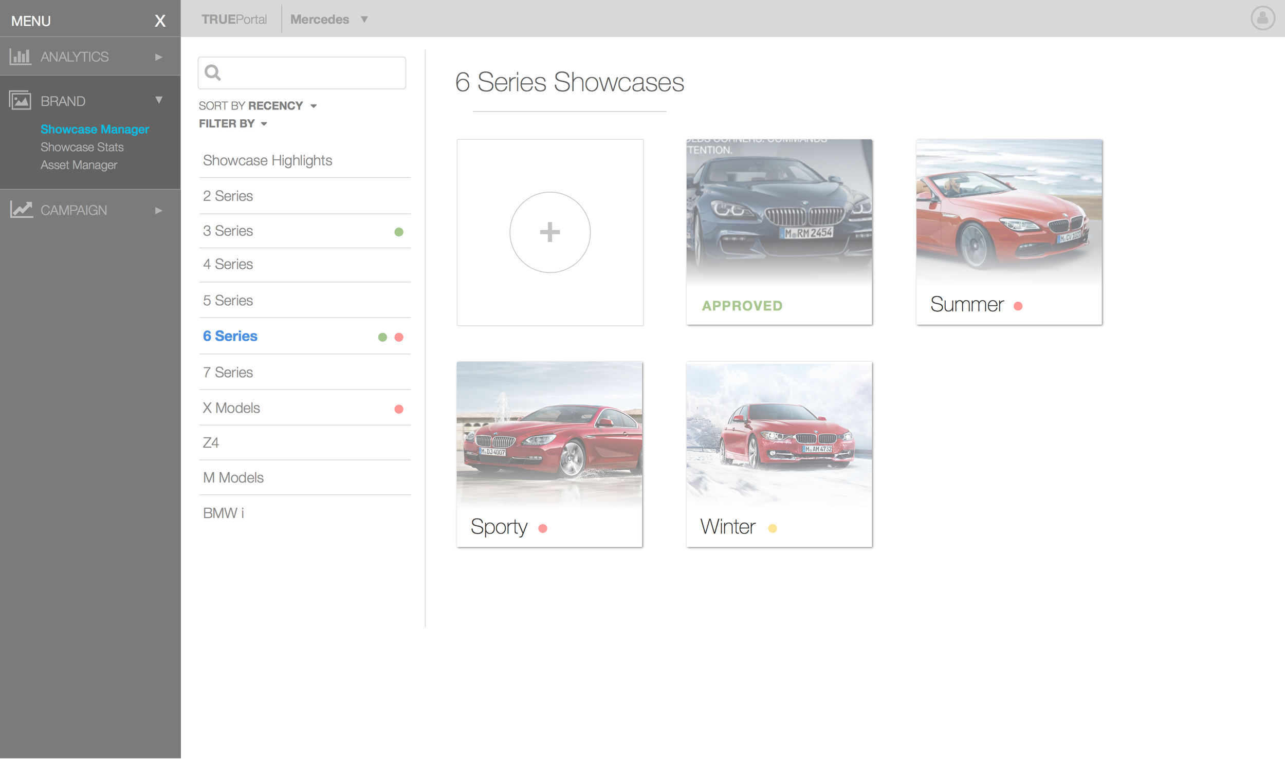
By the end of the ten weeks, we had created a production-level prototype with all of the front-end implementation completed. While one member of our team handled the coding, another organized documentation, and I spent time bettering the usability of individual elements. Two of the studies I conducted were on the "timeline" element of the Showcase Manager and the icon boxes for the showcase display.
The Timeline Study
The original timeline drew too much focus from the rest of the page. With solid bubbles and wide spacing it seemed more central than it should have been. Moreover, it took up a significant amount of precious real estate, pushing elements below the fold.
The following iterations are a sequence of designs I quickly constructed, trying differing styles and fills. The team ultimately settled on the minimal design featured in the bottom right corner. It was smaller, allowing information that had been moved below it to be moved next to it, seen in the screengrab below the iterations.
- The Box Study
The boxes we had were really just, blah. They didn't show much information. After showing our design to some product managers, they advised us to add information about launches, priority notifications, and other useful information. The original button icons:
To the left: An exploration of different forms that the buttons could take.
To the right: Two final choices showing different states that the buttons could take.


The final design that we settled on had a square shape to allow for more buttons per line as well as a rollover effect do display more information.
We also implemented different call-to-action colors:
- Red: A draft, the color choice is to signify high priority and push users to complete them (first success point)
- Yellow: The showcase is under review, saying, "keep this in the back of your mind"
- Green: The showcase is approved and ready for launch! Press the button!
- Gray: This showcase is live, thus it is low priority. It's just hanging out, gathering data and selling cars.
The final screens are those that are displayed above in Step 3. As of now, the product is still being developed by our former mentors, and I hope to be able to share some validation and success metrics soon! For now, check out our sketch on validation!
Thanks for reading!