
Sierra Nevada Tasting Menu
Reimagining The Beer Tasting Experience
In October of 2015, myself and four other friends participated in the CMYK Designation at UC Berkeley, hosted by the student organization Innovative Design and sponsored by the Sierra Nevada Torpedo Room. Of the prompts, we chose the goofier of the three, designing a new line of Sierra Nevada branded shampoo. Over the course of four hours, we produced two deliverables for the Torpedo Room and a brand new product: Sierra Nevada Shampoo. Ultimately, our team's submission was named "Most Original", awarded to us by a judging panel of distinguished product designers, typographers, and UI/UX designers. The following information details our design of the shampoo first, then shifts focus to one of our deliverables, a redesign of the Torpedo Room Tasting Menu, and finally, the exciting story of how Team Beersthetic became BAD Co. Design!
The Problem:
Most of the members of our team, Team Beersthetic, are in a Human Centered Design (HCD) Consulting club together, so we thought we'd define the problem and structure our process on the HCD framework. Thus, the user-centric definition: What would a person who would be interested in Sierra Nevada shampoo see as the problem?
“I want to define my lifestyle.
I want all my things to mirror who I am.
I am Sierra Nevada.”
We envisioned our persona to be attracted to the shampoo for the reasons to the left, as someone identifying strongly with the Sierra Nevada brand.
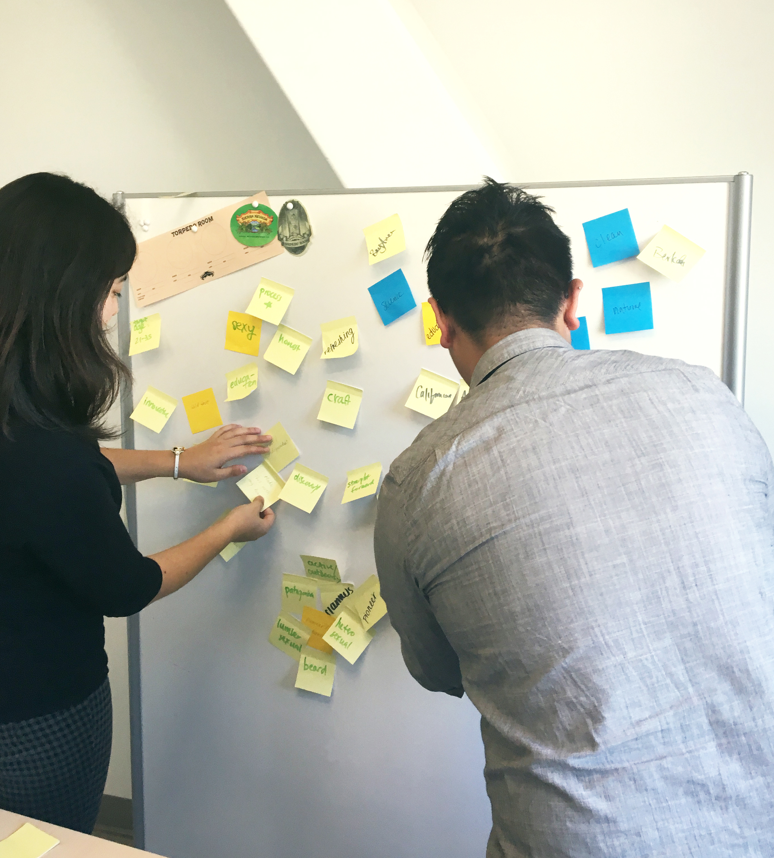
Step 1: Brainstorming & Research
Immediately after defining the problem, we jumped right into brainstorming. For the next 10 minutes, we scribbled key words that we thought related to the Torpedo Room and Sierra Nevada on Post-its and stuck them on a board, as quickly as possible, building an affinity diagram. Then, once the board was full of Post-its, we grouped them into categories: Where, Why, Values, Aesthetic, and Identities. From these categories. we identified the keywords Craft, Sustainability, and Exploration, as ideals that encompass not only The Torpedo Room, but also the Sierra Nevada Brand.
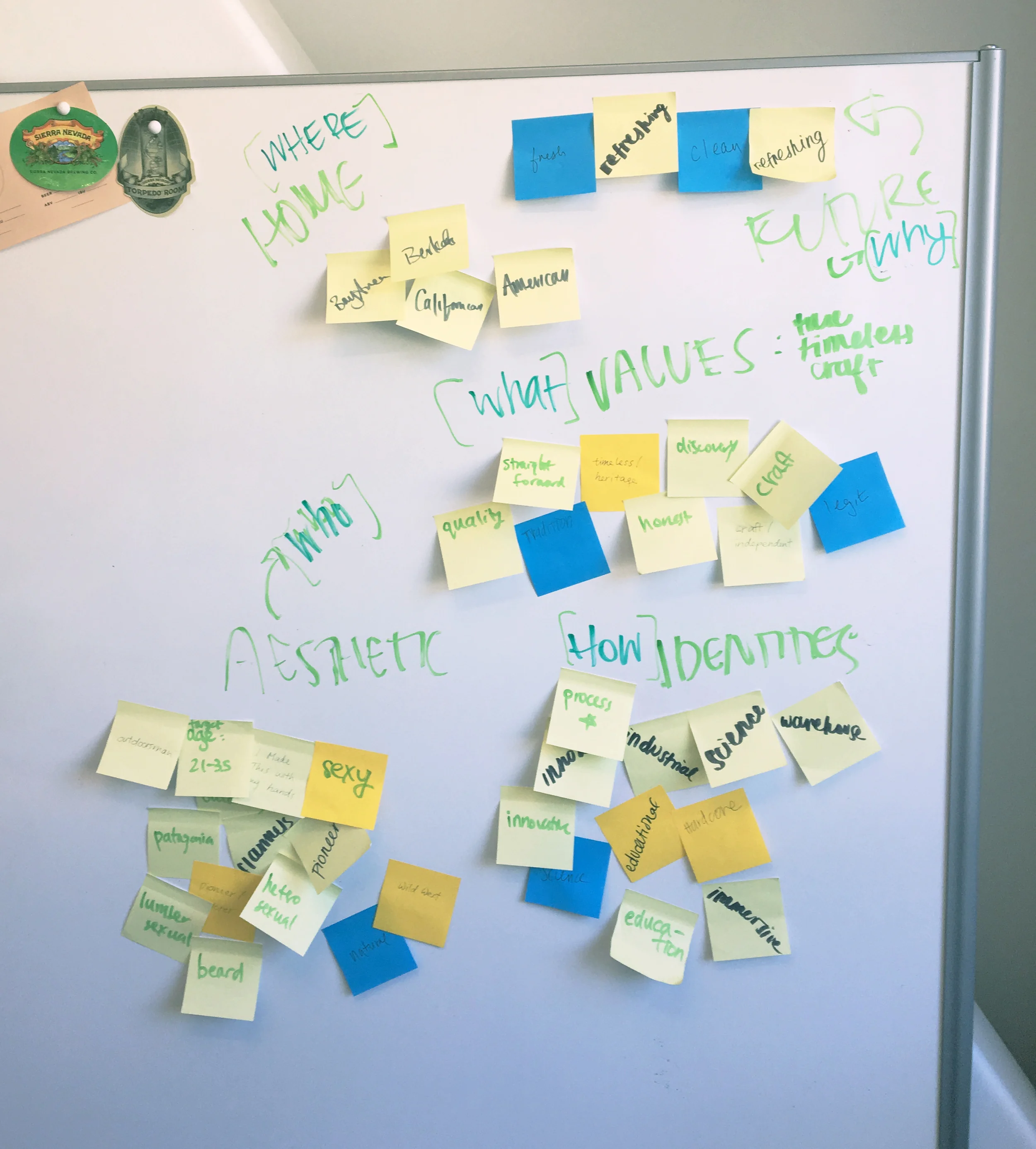
Then, we walked around the designathon, asking participants, organizers, and judges to answer the question: What comes to mind when you think of drinking Sierra Nevada beer?
Some answers we gathered were:
- Feel: Classy, Mature, Masculine
- Taste: Complex, Earthy, Sandalwood, Unique
- Body: Relaxed, Calm, Super Chill
As a team, we felt that the responses to the questions were highly insightful toward shaping the shampoo as a product, while the keywords that we identified earlier were more relevant for designing the other deliverables. Thus, our product statement:
“We want our shampoo to make you feel the way you feel when you take a sip of our cool beer.”
In the final stage of our research we had a discussion with the Torpedo Room Manager and Representative, Santino. Our goal was to learn more about how the Torpedo Room operates and ask about a curious piece of branded paper that was at the supplies table, seen in the image to the left.
What we learned:

- The paper, which was quite flimsy, was a tasting menu for customers to see information about the beers they were sampling at the Torpedo Room.
- The circles are where glasses of beer sit.
- Bartenders have to spend a lot of time writing and not serving because they have rotating taps and need to rewrite beer Names, ABVs, and IBUs, over and over.
- The Torpedo Room's identity is more "sexy and honest" and Santino felt that the beige paper did not encompass that.
*Skip the next block to see more on the tasting menu!
Step... Last?
At this point, I'll skip to the end of the shampoo design process and summarize what happened (more on the tasting menu below):
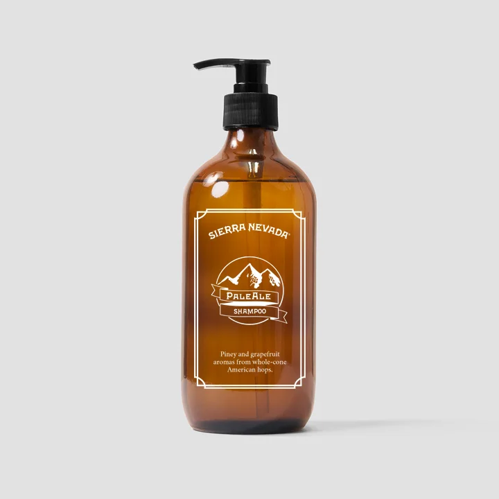
- The team felt that packaging the shampoo in a literal beer bottle was not only too "literal", but also too kitschy for the Beersthetic Persona that we had defined earlier. We decided on a sleek, amber-colored plastic bottle with a pump nozzle to still be reminiscent of a Sierra Nevada Beer, but not glass, as something that will be kept in the shower has a very high chance of falling (and possibly shattering, in the case of glass.)
- With the time constraints, we had difficulty creating more variations on our bottle label design and opted to depict the product using the extremely popular Sierra Nevada Pale Ale in a straightforward cream color. We had difficulty creating a logo that is as illustrative and beautiful as the iconic Sierra Nevada logo, something that definitely held us back. The design decisions behind the logo:
- The border, mountains, banner, and font mirror those of the actual Sierra Nevada logo to connect the product with the brand.
- Our logo is more minimal, catering to the "sexy and honest" identity of The Torpedo Room, where we felt that our shampoo could be for sale as an exclusive novelty item.
- We learned that our strengths are in developing the experience of a product from a Human Centered Design perspective, but our drawing skills may need some work.
Step 2: Bug Identification
As the countdown clock ticked closer and closer to submission time, we quickly listed out some design flaws that we saw in the tasting menu (photo for reference):
- The paper tasting menu uses up a lot of paper, contradicting the sustainability factor that is so important to Sierra Nevada.
- Having the tasting menu be paper not only makes it easily waterlogged by the many cups of beer resting on top, but it then makes it, well, gross, for the customer to have to take home a soggy piece of paper.
- As a bartender, having to take the time to write out the Name, ABV, and IBU four times for each customer is too time consuming.
- The logo for the Torpedo Room is ultimately obscured by all of the glasses, once the tasting is set up.
Step 3: First Prototype Development
This is the last step we completed at the designathon. Our solution:
- Higher Quality & Reusable Tasting Menus: Make the tasting menu a wooden tray that can be reused over and over. It'll look much better than the thin paper version, and also cut down on the paper waste.
- Inlaid Beer Cards: By etching beer information onto a laser cut wood card, it can not only be inlaid into the wooden tray, cut down on the need for the bartender to write each beer's information over and over, but also ensure clarity in understanding beer information, for the customer.
- Circular Cut Outs: Tasting-glass-sized holes where printed circles had been will also speed up the placement process as the bartender also does not need to worry about carefully placing the glasses over the printed circles, but rather quickly fit a glass into the bevel.
- Rearranging Visuals: Increasing visibility of logos and branding
Some miscellaneous ideas we also integrated:
- Cracker Slot: Someone randomly remembered Santino mentioning that water crackers are served as a palate cleanser, so we figured, why not add a slot for that, to round out the tasting set up?
- Displaying Advertisements: With the extra real estate in the circle cut outs, we found them to be excellent locations to insert advertisements, especially for the "Sierra Nevada Shampoo"! We were inspired by printed images on the inside of clear bottles.
In the eleventh hour, we rushed downstairs to the laser cutting workshop and quickly cut and assembled our prototype in time for presentations.
The Finished Product at the Designathon:
Using a polished tasting menu, coupled with the wood styling, will match the identity of the Torpedo Room much more than the previous beige paper tasting menu. It'll add to the "sexy and honest" atmosphere and match the decor of the entire space.


Step 4: Iteration
After we won "Most Original" at the designathon, we were inspired to take our prototype to Santino at the Torpedo Room and possibly turn what had been a side project at the designathon, into a real product. As it turns out, he loved the idea, and we are currently in the throes of working on a second prototype! Some changes we've planned:
- A thicker base plate to minimize curvature in the center
- Cutouts for fingers to ease lifting and set up of the tray
- Rounded corners for safety
- Rubber feet to offset slipping on what may be a wet countertop, as well as slightly elevate the tray
- Lacquered wood to provide waterproofing against the wet atmosphere of beer tasting
We're all swamped with school and finals for now, but i'll update this page in the coming days and weeks as we make more progress!
The BAD Co Story: The five of us bonded at the designathon and discovered that as a team, we work great together! Also, since Team Beersthetic has a real client now, we needed a more general name... and it's acronym will remain undisclosed for now...